Case study — Revamping multi-brand Information architecture
TL;DR
By adopting a user-centred approach and aligning with business objectives, our revamped information architecture aims to provide scalable, intuitive, and efficient navigation. Continuous feedback and iterative enhancements will ensure it evolves with user needs and supports business growth.
My role and contribution
Lead designer
Timeline
4 weeks
* This case study uses simulated data due to NDA restrictions.
EMPATHISE
2
3
Identifying user and business challenges
Problem
As our company expanded its product offerings, including whitelabel solutions, a D2C app, and web programs, managing information became increasingly complex. I’ve analysed 72 user tickets to identify common issues and pain points, including:
Users struggled to locate certain features, leading to an increase in support tickets.
Navigation issues caused delays in task completion, impacting user satisfaction and productivity.
Inconsistent information architecture across products confused users and hindered their ability to use our applications effectively.

EMPATHISE
2
3
A primary goal
Goal
The primary goal of this initiative was to develop a holistic information architecture strategy to enhance user experience and ensure scalable, intuitive navigation across all our products. This involved:
Identify and document at least 95% of existing gaps and inconsistencies in the current IA.
Collect and analyse insights from at least 80 users and 10 business stakeholders.
Creating an updated, user-centric IA that simplifies navigation, reduce navigation-related support tickets by 40% reduces support tickets, increase engagement with key features by 25% and improve user retention by 15%.
EMPATHISE
2
3
1st things 1st - User research
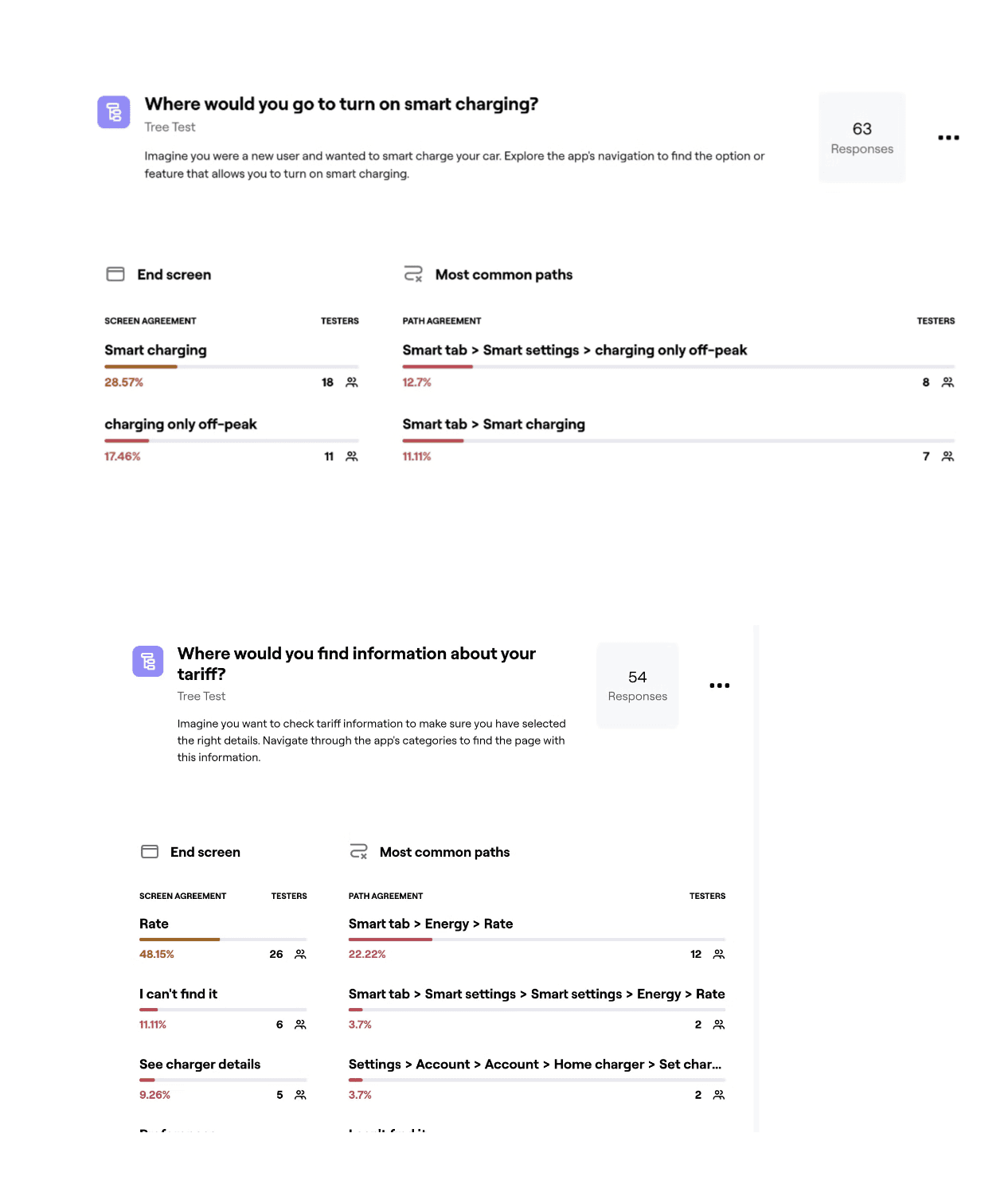
Card sorting and Tree testing
As a first step I started to identify IA gaps in the current app experience via research. I used two methods: card sorting and tree testing.
Findings
70 % of users expect the main CTA to be more visible.
High difficulty in locating certain features led to user frustration with 40% bounce rate.
Using a clear patterns for control related features.
EMPATHISE
2
3
Initial hypothesis
A more intuitive IA will lead to:
- 40-46% increase user retention rate
- 20% increase in user growth and conversion rates
- achieving a user growth rate of 12% per quarter (up from 10%) within six months of implementation
1
2. CONCEPTUALISE
3
Understanding the current landscape
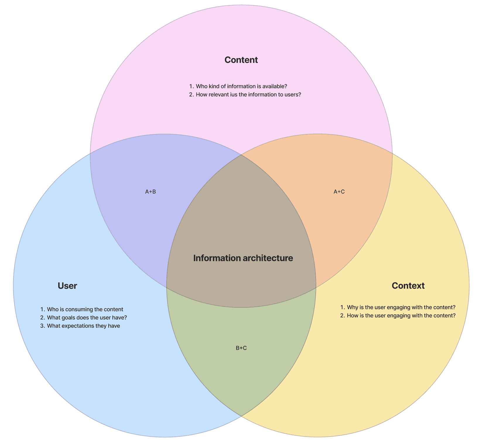
Information audit
Audit involved mapping out the current IA, identifying gaps, and noting inconsistencies across our products.
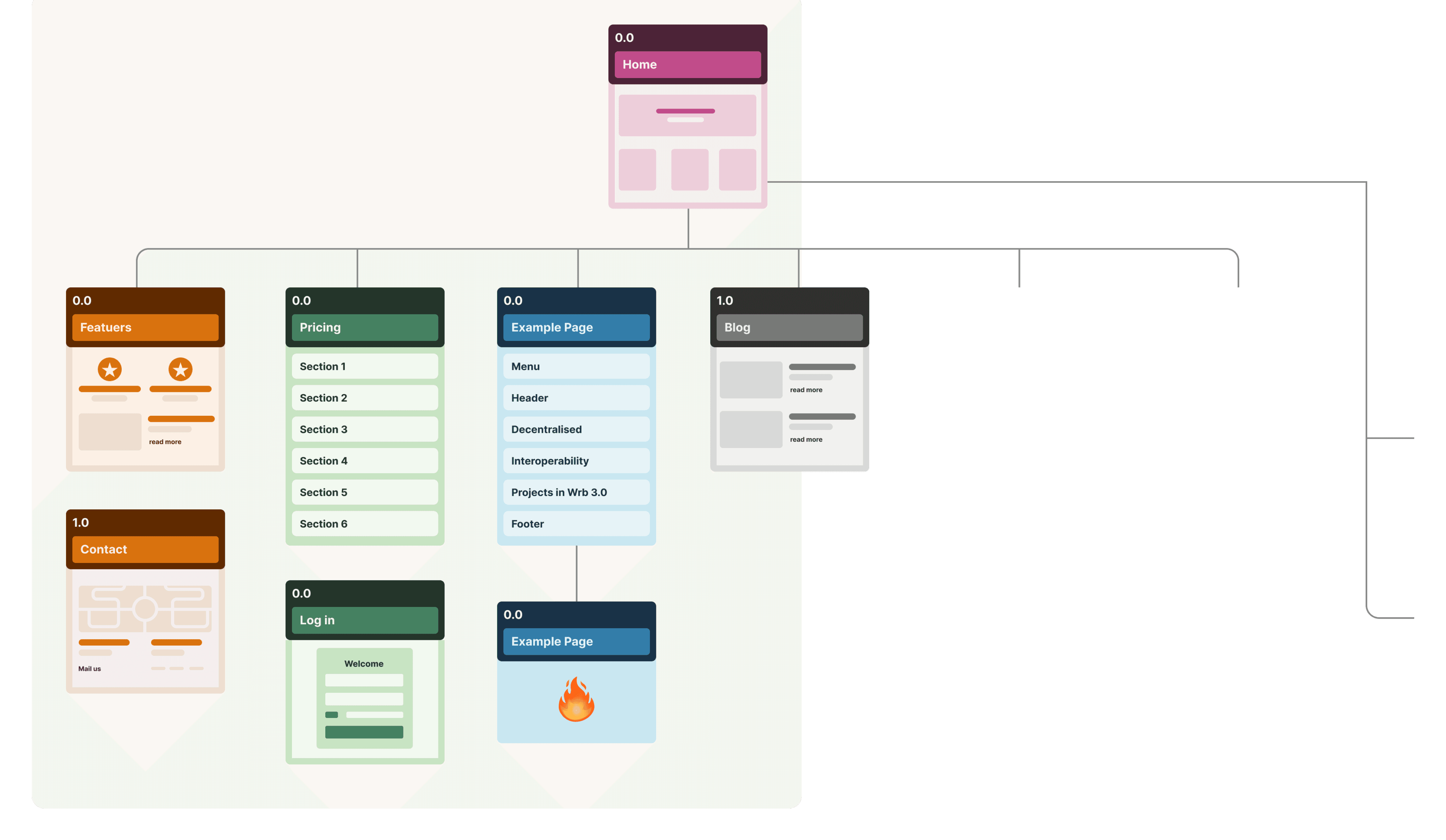
Sitemap
It showed the parent-child relationships and the overall hierarchy and structure of the app.
Findings
The audit and sitemap revealed 8 different inconsistencies, hierarchy issues, complex structures and navigational problems.

1
2. CONCEPTUALISE
3
Influence and evaluate
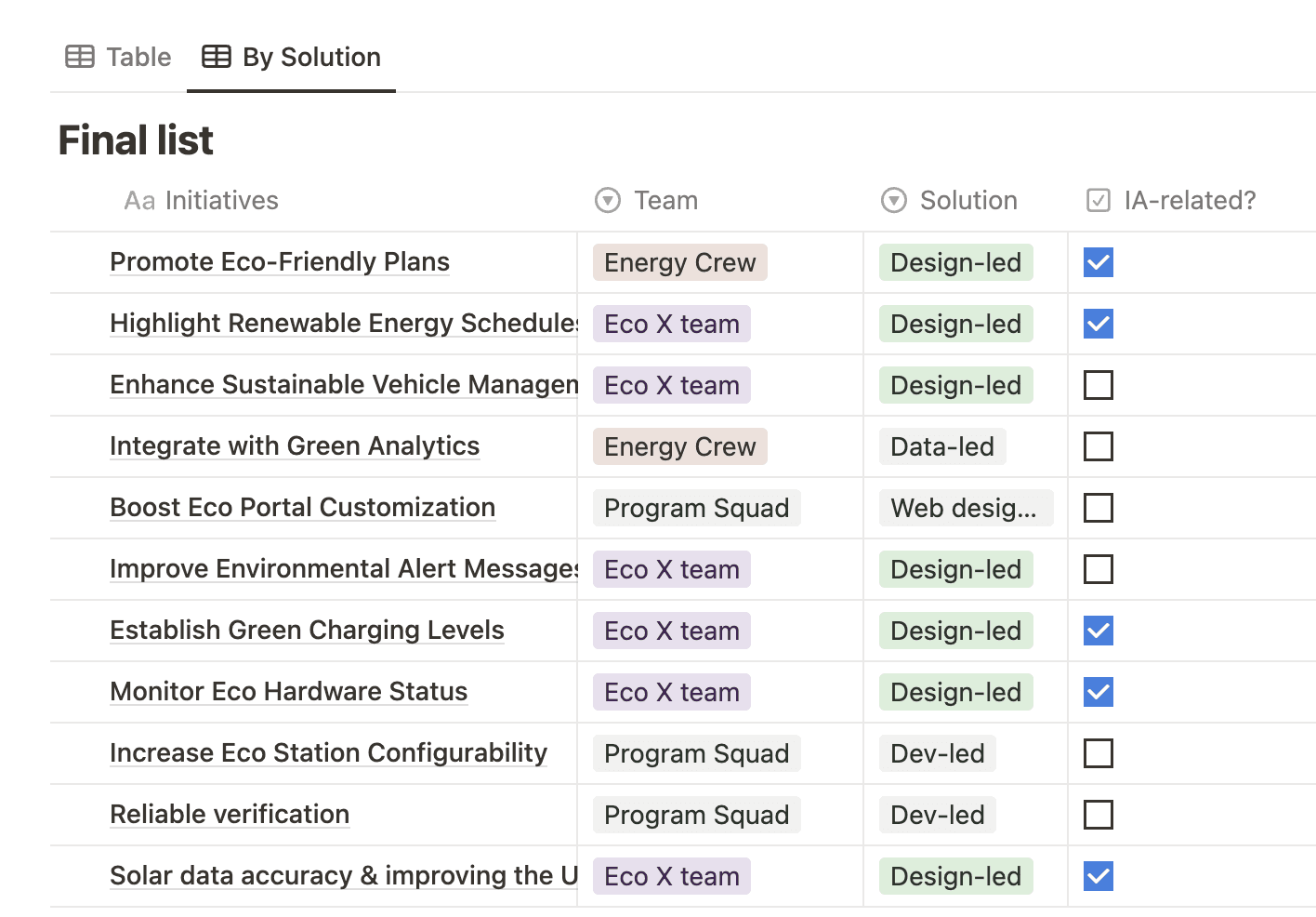
Influencing with workshops
Following the audit, I conducted two workshops: one with the design team to gather additional perspectives on the current IA opportunities and another with broader stakeholders with business, engineering and product expertise.
P.R.I.C.E. scoring evaluation
I’ve ranked the findings based on Priority, Reach, Impact, Confidence and Effort.
1
2. CONCEPTUALISE
3
Business strategy
Business strategy
Engage users through gamification and transparency.
Adapt IA to accommodate changes in utility programs and hardware updates.
ccEnsure scalability and flexibility in IA design.
Future product roadmap
I’ve listed the features to be built in the coming months, focusing on high-impact changes that address key user needs. Plans for ongoing workshops and iterative improvements to keep the IA relevant and user-centric.
1
2
3. DESIGN
Future IA
After reviewing the existing information architecture including design product users and business considerations, I started map out a new IA sitemap.

1
2
3. DESIGN
Developing the new IA system
Blue sky concepts
According to the new sitemap, I’ve explored innovative and forward-thinking ideas and envisioned potential future states of our product IA with higher fidelity wireframes.

1
2
3. DESIGN
A lot more to do
Finalising the IA design
Conduct final review sessions with stakeholders to gather and incorporate feedback into high-fidelity wireframes.
Prototyping and usability testing
Create interactive prototypes using tools like Figma. Validate the new IA through usability testing sessions.
Launch
Soft and full launch: Conduct a beta testing phase to gather initial feedback, then roll out the new IA to all users after addressing feedback.
Measure success
Continuously track user interactions, support tickets, and key metrics to ensure performance.
Continuous improvement
Feedback loop: Establish a regular process to gather ongoing user insights, provide regular updates, and help teams and users adapt to the new IA.