1
2
3. DESIGN
Future steps: Continuing the journey
Based on current insights and user feedback, future enhancements will include:
Integration with popular social media platforms to increase community engagement.
Advanced analytics features for better tracking of user progress.
Continued improvements to accessibility features based on user needs.
Turn the UI kit into a design system as the product grows.
12px
16px
18px
20px
160px
24px
90px
40px
Assets
urse
Design System
On

Colors
Accent Secondary
Accent Primary
Primary
Grayscale
Gray 10
#E0E0E6
Gray 30
#A2A2B5
White
#FFFFFF
Gray 50
#666680
Gray 80
#1C1C23
Gray 70
#353542
Gray 60
#4E4E61
Gray 100
#0E0E12
Primary 500
#5579DB
Primary 20
#8BA6F0
Primary 100
#2E5AD3
Accent P 50
#FFA699
Accent P 0
#FFD2CC
Accent P 100
#FF7966
Accent S 50
#7DFFEE
Accent S 100
#00FAD9
urse
Design System
On
Typography
Body Small
Body Medium
Body Large
Subtitle
Headline 1
Headline 2
Headline 3
Headline 4
Headline 5
Headline 6
Headline 7
Headline 8
12px
14px
16px
20px
12px
14px
16px
20px
24px
32px
40px
56px
urse
Design System
On
ABCDEFGHIJKLMNOPQRSTUVWXYZ
abcdefghijklmnopqrstvwxyz
Regular, Medium, Bold
Plus Jakarta sans
Components
urse
Design System
On
3
3
3
3
3
Get started
I have an account
1
2
3. DESIGN
Projected outcomes: Measuring success with HEART
Although the app did not launch, success and impact would have been tracked using the HEART framework:
Happiness: Elevated app ratings and positive feedback, indicating users found the app enjoyable and useful.
Engagement: Increased app usage, implying more users frequently engaging with the app.
Adoption: Growth in new sign-ups, reflecting more users discovering the app.
Retention: Lower attrition rates and more subscription renewals, showing the app's continued value.
Task success: Decrease in incomplete task attempts, suggesting the app was successful in helping users achieve their goals.
1
2
3. DESIGN
Final UI


1
2
3. DESIGN
Iterating for excellence
Challenges:
The initial designs were too complex, causing confusion among users. Specifically, 8 out of 15 users were unsure of what to do on the community subpage. However, all users quickly understood how to check stats and switch between course platforms, including the messenger feature.
Users expected to view profiles of app members before following or interacting, indicating a need for clearer and more accessible profile information.
Solution
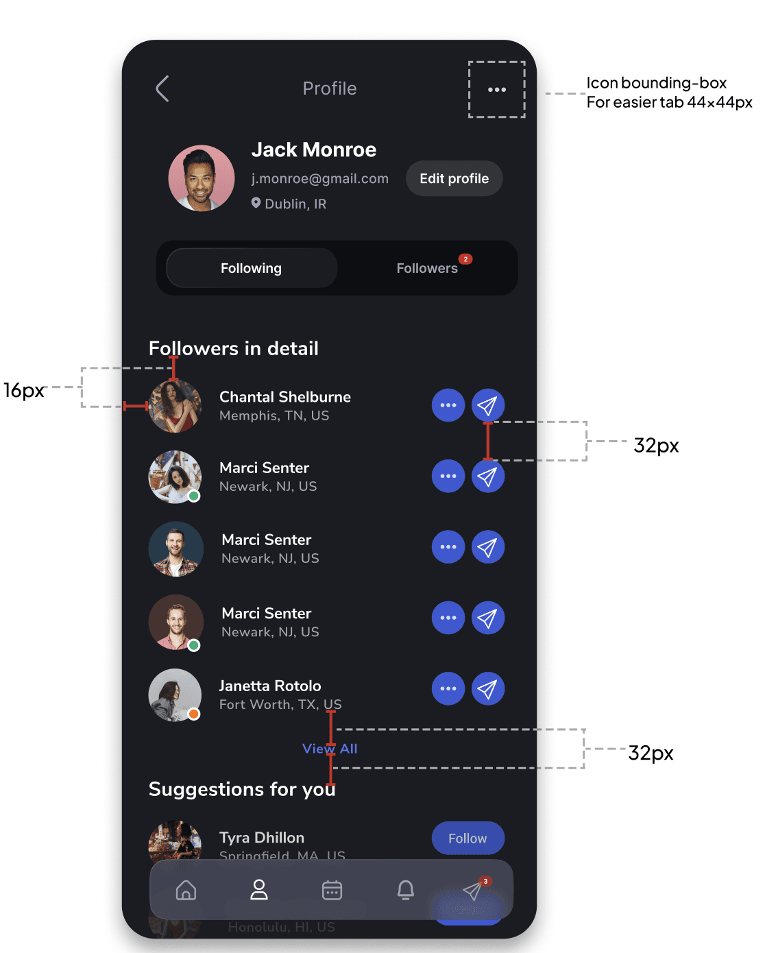
I added a "Things in common" screen that highlights common interests and courses taken in a user's profile. This feature improved interaction and community engagement, leading to a 60% success rate for the task.


Case study — SaaS E-learning Revolution
TL;DR
I conducted market analysis and designed UI/UX improvements for a new educational app. Projected outcomes included increased app ratings, usage, and sign-ups, with lower incomplete task rates. User testing showed 75% found the interface intuitive, 80% felt clearer progress, and 70% appreciated community features.
My role
Sole product designer
Timeline
3 weeks

EMPATHISE
2
3
Identifying the challenge
Context
I am an avid enthusiast of educational platforms and their extensive online courses. The potential they hold for providing equal and affordable education to people worldwide is truly inspiring.
Problem
Through my extensive use of various educational apps, I've encountered several challenges:
Unintuitive interfaces
Lack of a clear sense of progress
Insufficient sense of community
Goal
The aim is to develop a more intuitive, seamless, and visually appealing user experience. This involves: enhancing progress tracking, ensuring ease of use, creating opportunities for interaction and community building, aligning the design with user needs and expectations.
EMPATHISE
2
3
Market deep dive
I conducted a thorough market analysis to understand the competitive landscape. This involved reviewing similar apps, identifying user needs, and pinpointing gaps in the current market offerings.
This analysis helped me identify unique opportunities to differentiate our product.
Spent on subs this year
$103,000
+8.8%
EMPATHISE
2
3
Competitor insights
User experience for progress tracking and subscriptions - competitors offer varied methods for tracking progress and charging for subscriptions, but the user experiences are not consistently valuable.
Lack of integration - No competitors provide integration with other platforms, limiting their functionality and interoperability.
Complementary products - competitors complement each other more than they compete, each having unique strengths that could be combined for a comprehensive solution.


1
2. CONCEPTUALISE
3
Crafting the journey
I created detailed user flows to ensure a smooth and intuitive user experience. These flows mapped out the entire user journey, from registration to course completion and sharing with friends.
As a result:
Identified potential pain points
Ensured a logical progression of actions

1
2. CONCEPTUALISE
3
Ideation in action: Sketches
With user insights in hand, I began the sketching phase, brainstorming and exploring various design concepts.
As a result:
Quickly iterated on 10+ design ideas.
Visualised potential solutions to key problems
Sketching allowed me to quickly iterate on ideas and visualise potential solutions before moving into more detailed design work.

1
2. CONCEPTUALISE
3
Building the framework: From Sketches to Wireframes
The next step was to transform sketches into wireframes.
These low-fidelity designs focused on layout and structure, allowing us to refine the functionality and flow without getting distracted by visual details.
_
_
Add Platforms without plan
Available Platforms
0-2
3+
Features
Classic
Premium
Ability to freeze courses up to 2 months
24/5 Email and phone support
Membership for community
Choose your subscription
Subscription plans
Next
Go back
Coursera
In detail
Google UX Design Professional
Build Wireframes and Low-Fidelity Pro...
Machine Learning Specialization
Master fundamental AI concepts
Machine Learning Specialization
Master fundamental AI concepts
In detail
Settings
Security
2 step verification
Account
Contacts syncing
Account ownership
My subscriptions
Upgrade plan
Summary
Default currency
General
Theme
Font
j.monroe@gmail.com
Dublin, IR
Jack Monroe
Followers in detail
Chantal Shelburne
Memphis, TN, US
Chantal Shelburne
Memphis, TN, US
Chantal Shelburne
Memphis, TN, US
Chantal Shelburne
Memphis, TN, US
Chantal Shelburne
Memphis, TN, US
View All
Chantal Shelburne
Memphis, TN, US
Edit profile
Community
Will be available till
per month
Coursera
$28.99
Will be available till
per month
Coursera
$28.99
Will be available till
per month
Domestika
$18.99
Will be available till
per month
Domestika
$18.99
in upcoming bill
$52.98
01.03.2023
August
08
Mo
09
Tu
10
We
11
Th
12
Fr
13
Sa
14
Su
August
Individual Subs
Schedule
Yearly
Pay for a full year
$
/ m
12
Monthly
Pay monthy, cancel any time
$
/ m
12
Subscription plans
Start Your 7-days Free Trial
Go back
Premium
Choose your subscription
Select a payment method
or
No commitments. Cancel anytime.
45 min ago
Mark Ruffalo
Lorem Ipsum is simply dummy text of the printing
29 min ago
Jhon Deo
Hey there, Would you have a recommendation for me about Graphics...
21 min ago
Adriene Watson
Hey there, Would you have a recommendation for me about Graphics...
15 min ago
John Carilo
Hey there, Would you have a recommendation for me about Graphics...
9 min ago
Robert Bacins
Hey there, Would you have a recommendation for me about Graphics...
1 min ago
Shelby Goode
Hey there, Would you have a recommendation for me about Graphics...
Search
Messages
See in detail
Skillshare
Coursera
See in detail
Domestika
See in detail
View All
Add new course
Spent in total
187h
Your courses and results
1
2
3. DESIGN
User feedback and testing
During the testing phase, I’ve created a realistic prototype and collected feedback from 15 users to refine the design further.
Key positive insights:
75% of users found the new interface more intuitive.
80% of users felt a clearer sense of progress.
70% of users appreciated the enhanced community features.