Oncourse
TL;DR I conducted market analysis and designed UI/UX improvements for a new educational app. Projected outcomes included increased app ratings, usage, and sign-ups, with lower incomplete task rates. User testing showed 75% found the interface intuitive, 80% felt clearer progress, and 70% appreciated community features. My role Sole product designer Timeline 3 weeks Identifying the challenge Context I am an avid enthusiast of educational platforms and their extensive online courses. The potential they hold for providing equal and affordable education to people worldwide is truly inspiring. Problem Through my extensive use of various educational apps, I’ve encountered several challenges: Unintuitive interfaces Lack of a clear sense of progress Insufficient sense of community Goal The aim is to develop a more intuitive, seamless, and visually appealing user experience. This involves: enhancing progress tracking, ensuring ease of use, creating opportunities for interaction and community building, aligning the design with user needs and expectations.
EMPATHISE 2 3
Market deep dive
I conducted a thorough market analysis to understand the competitive landscape. This involved reviewing similar apps, identifying user needs, and pinpointing gaps in the current market offerings.
This analysis helped me identify unique opportunities to differentiate our product.

Competitor insights
User experience for progress tracking and subscriptions – Competitors offer varied methods for tracking progress and charging for subscriptions, but the user experiences are not consistently valuable.
Lack of integration – No competitors provide integration with other platforms, limiting their functionality and interoperability.
Complementary products – Competitors complement each other more than they compete, each having unique strengths that could be combined for a comprehensive solution.

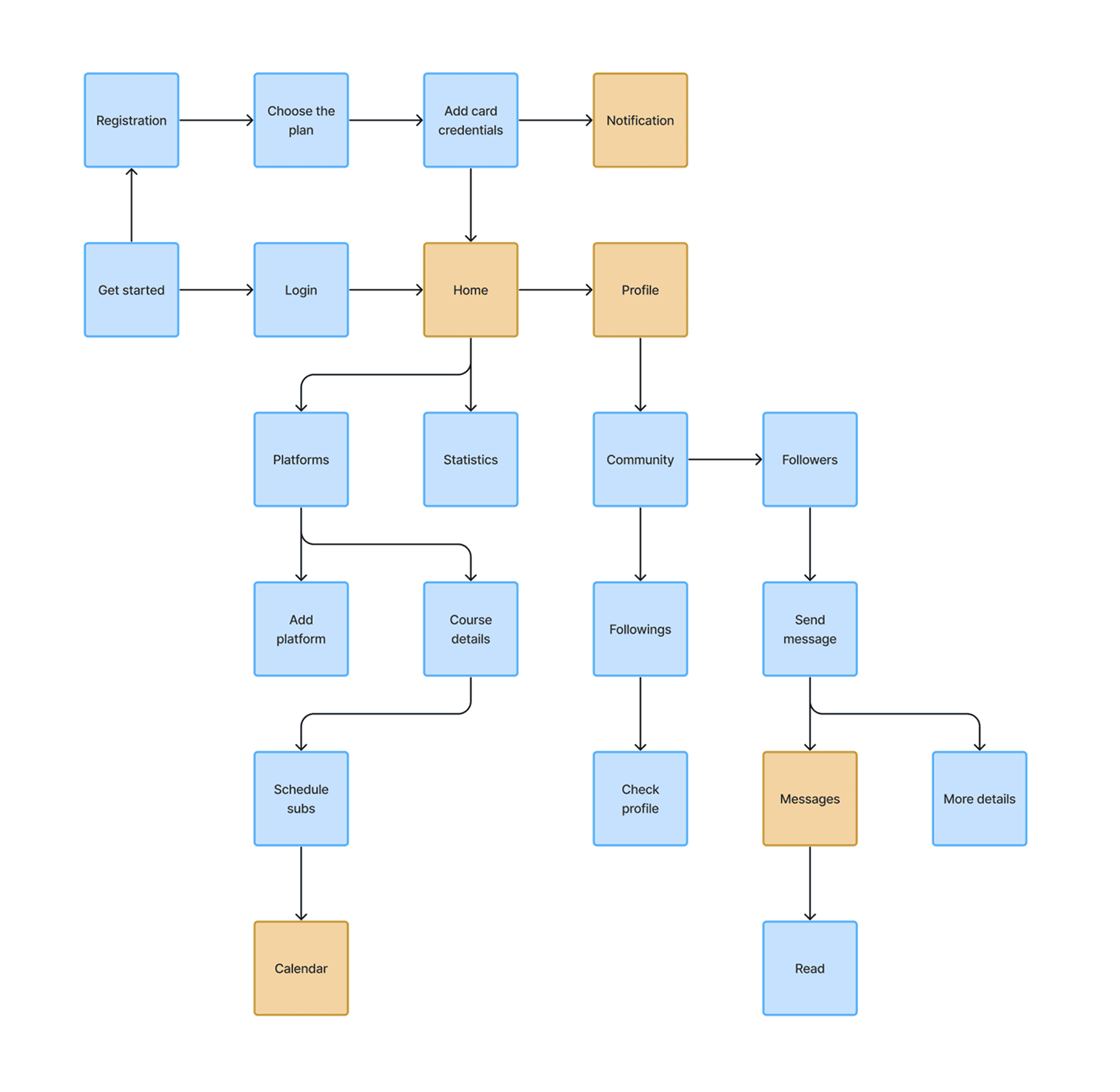
Crafting the journey
I created detailed user flows to ensure a smooth and intuitive user experience. These flows mapped out the entire user journey, from registration to course completion and sharing with friends.
As a result:
Identified potential pain points
Ensured a logical progression of actions
1 2. CONCEPTUALISE 3
Ideation in action: Sketches
With user insights in hand, I began the sketching phase, brainstorming and exploring various design concepts.
As a result:
Quickly iterated on 10+ design ideas
Visualised potential solutions to key problems
Sketching allowed me to quickly iterate on ideas and visualise potential solutions before moving into more detailed design work.

1 2. CONCEPTUALISE 3
Building the framework: From Sketches to Wireframes
The next step was to transform sketches into wireframes.
These low-fidelity designs focused on layout and structure, allowing us to refine the functionality and flow without getting distracted by visual details.

1 2 3. DESIGN
User feedback and testing
During the testing phase, I’ve created a realistic prototype and collected feedback from 15 users to refine the design further.
Key positive insights:
75% of users found the new interface more intuitive.
80% of users felt a clearer sense of progress.
70% of users appreciated the enhanced community features.

1 2 3. DESIGN
Iterating for excellence
Challenges:
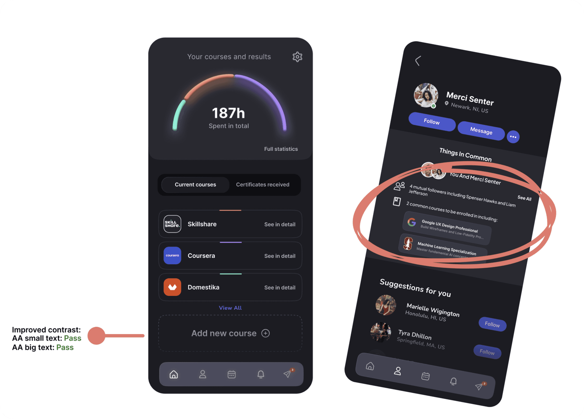
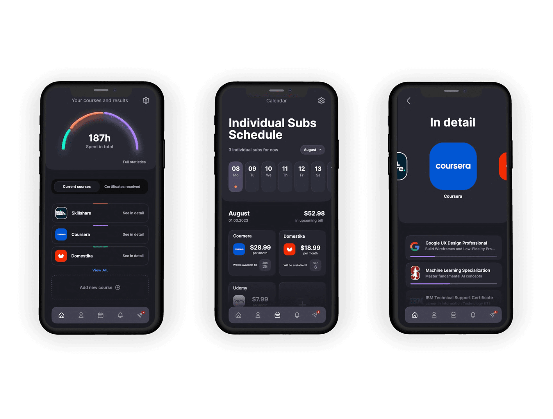
The initial designs were too complex, causing confusion among users. Specifically, 8 out of 15 users were unsure of what the community subpage. However, all users quickly understood how to check stats and switch between course platforms, including the user progress feature.
Users expected to view profiles of app members before following or interacting, indicating a need for clearer and more accessible information.
Solution
I added a “Things in common” screen that highlights common interests and courses taken in a user’s profile.
This feature improved interaction and community engagement, leading to a 60% success rate for the task.
1 2 3. DESIGN
Projected outcomes: Measuring success with HEART
Although the app did not launch, success and impact would have been tracked using the HEART framework:
Happiness: Elevated app ratings and positive feedback, indicating users found the app enjoyable and useful.
Engagement: Increased app usage, implying more users frequently engaging with the app.
Adoption: Growth in new sign-ups, reflecting more users discovering the app.
Retention: Lower attrition rates and more subscription renewals, showing the app’s continued value.
Task success: Decrease in incomplete task attempts, suggesting the app was successful in helping users achieve their goals.
1 2 3. DESIGN

Future steps: Continuing the journey
Based on current insights and user feedback, future enhancements will include:
Integration with popular social media platforms to increase community engagement.
Advanced analytics features for better tracking of user progress.
Continued improvements to accessibility features based on user needs.
Turn the UI kit into a design system as the product grows.
